The Importance of Styling in a Senior Session
Have you ever wondered why you are drawn to some images far more than others? Have you ever wondered why some images make you stop your scroll and others don’t? Two of the reasons that your eye may be drawn to an image is because of styling and color theory, which are the things I will talk about in this blog.
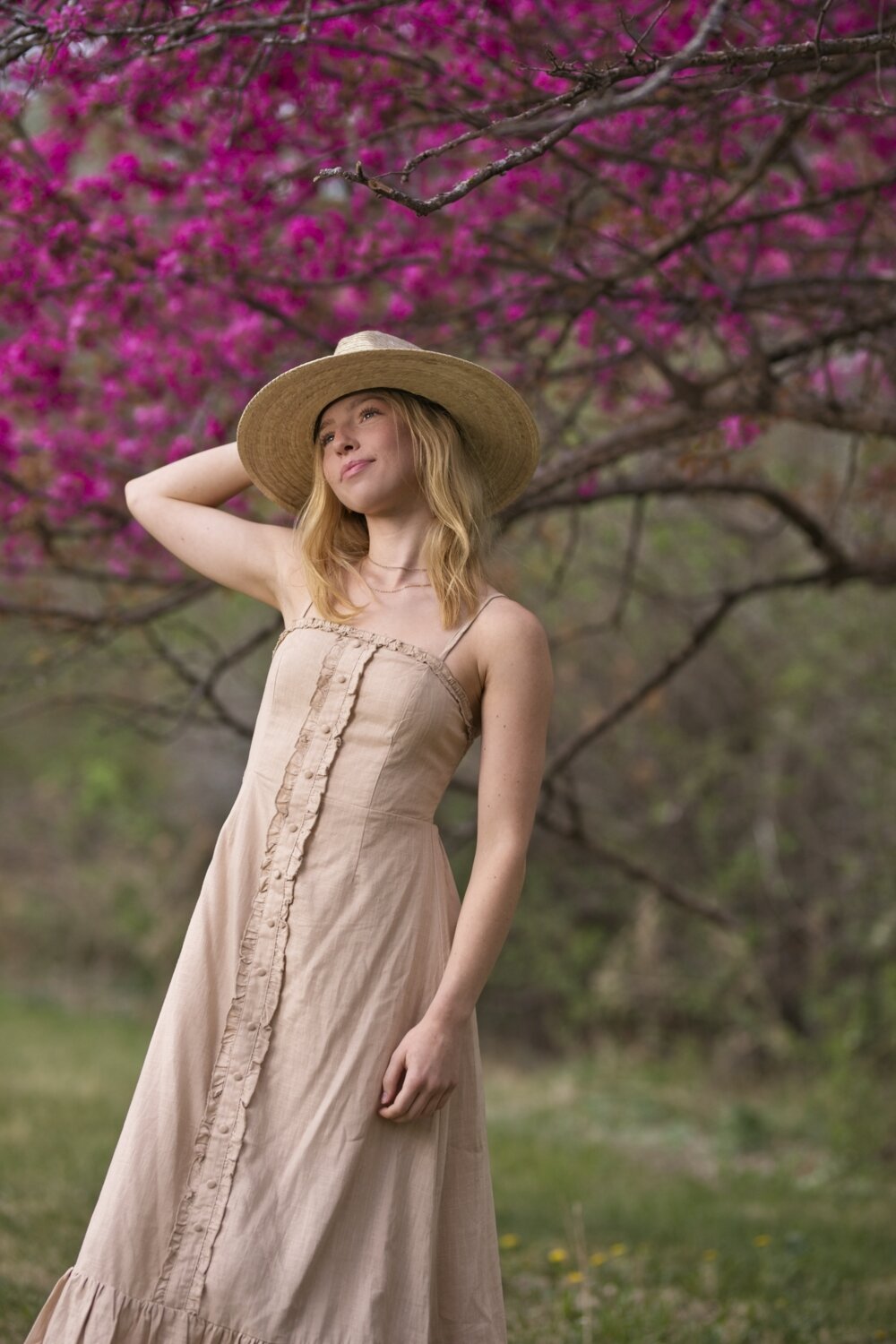
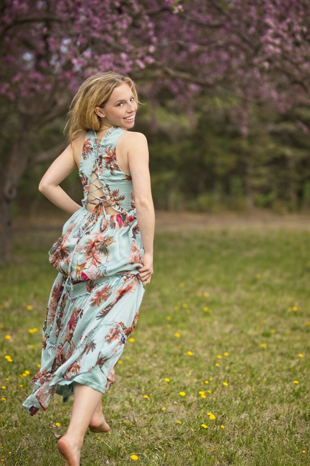
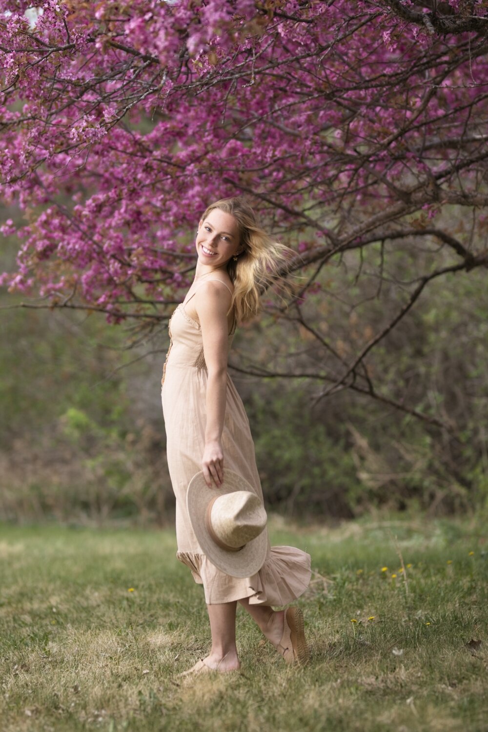
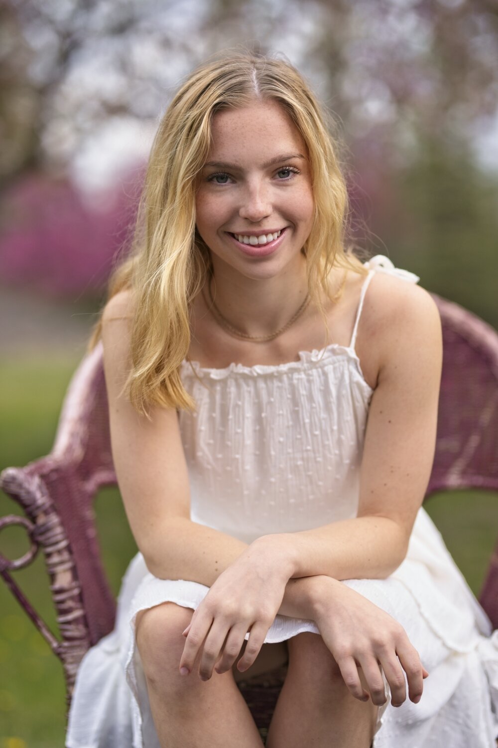
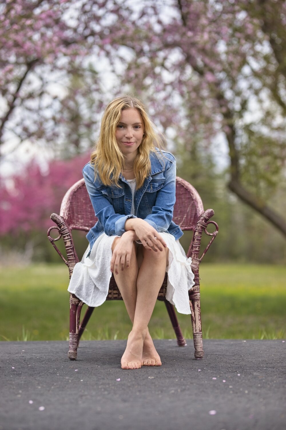
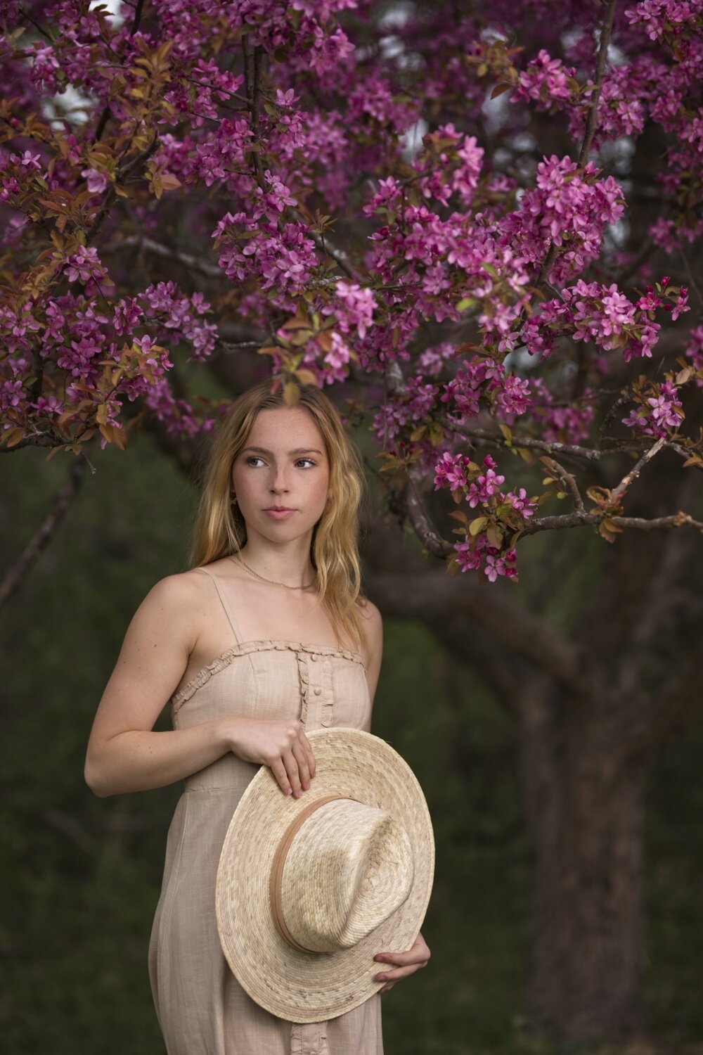
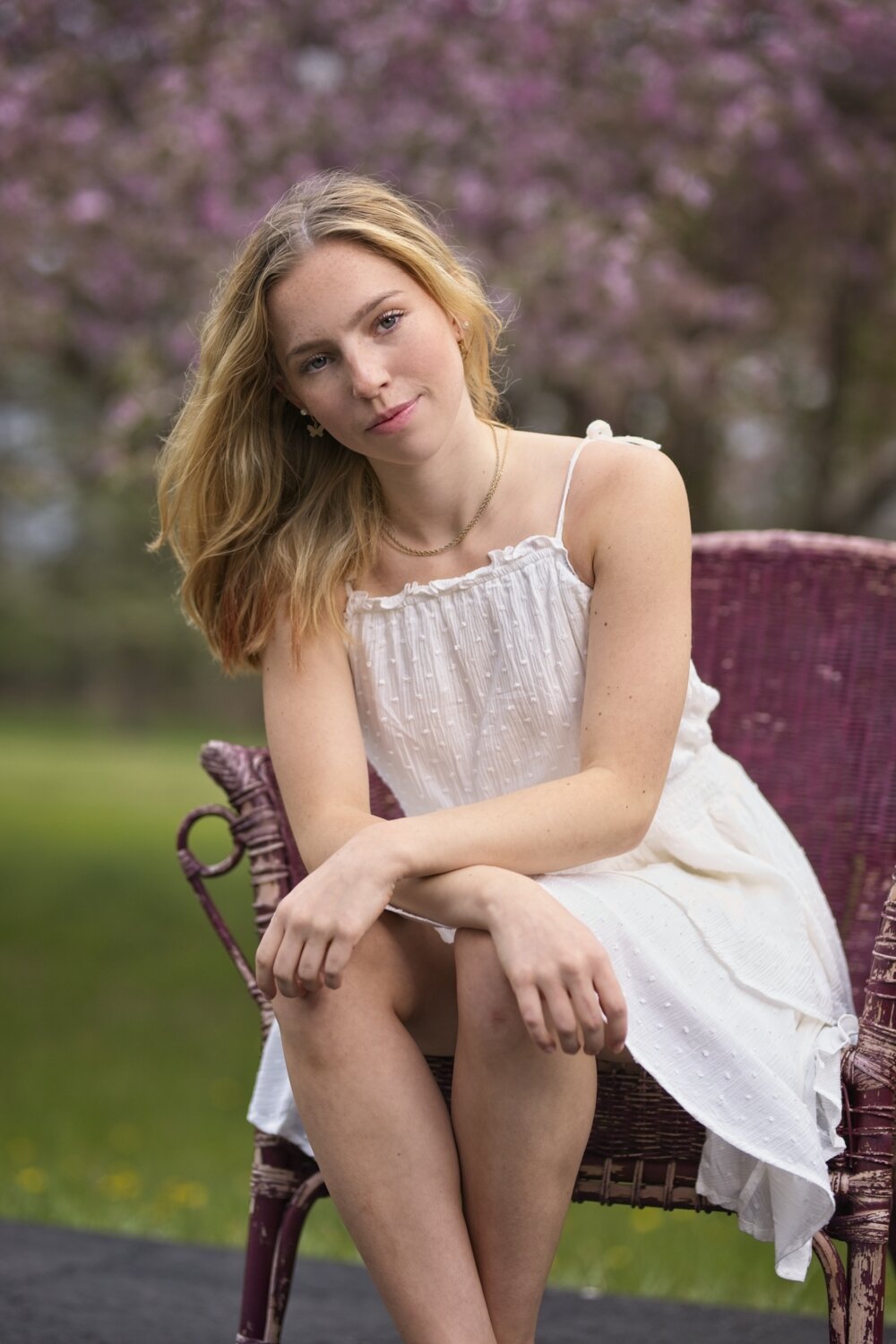
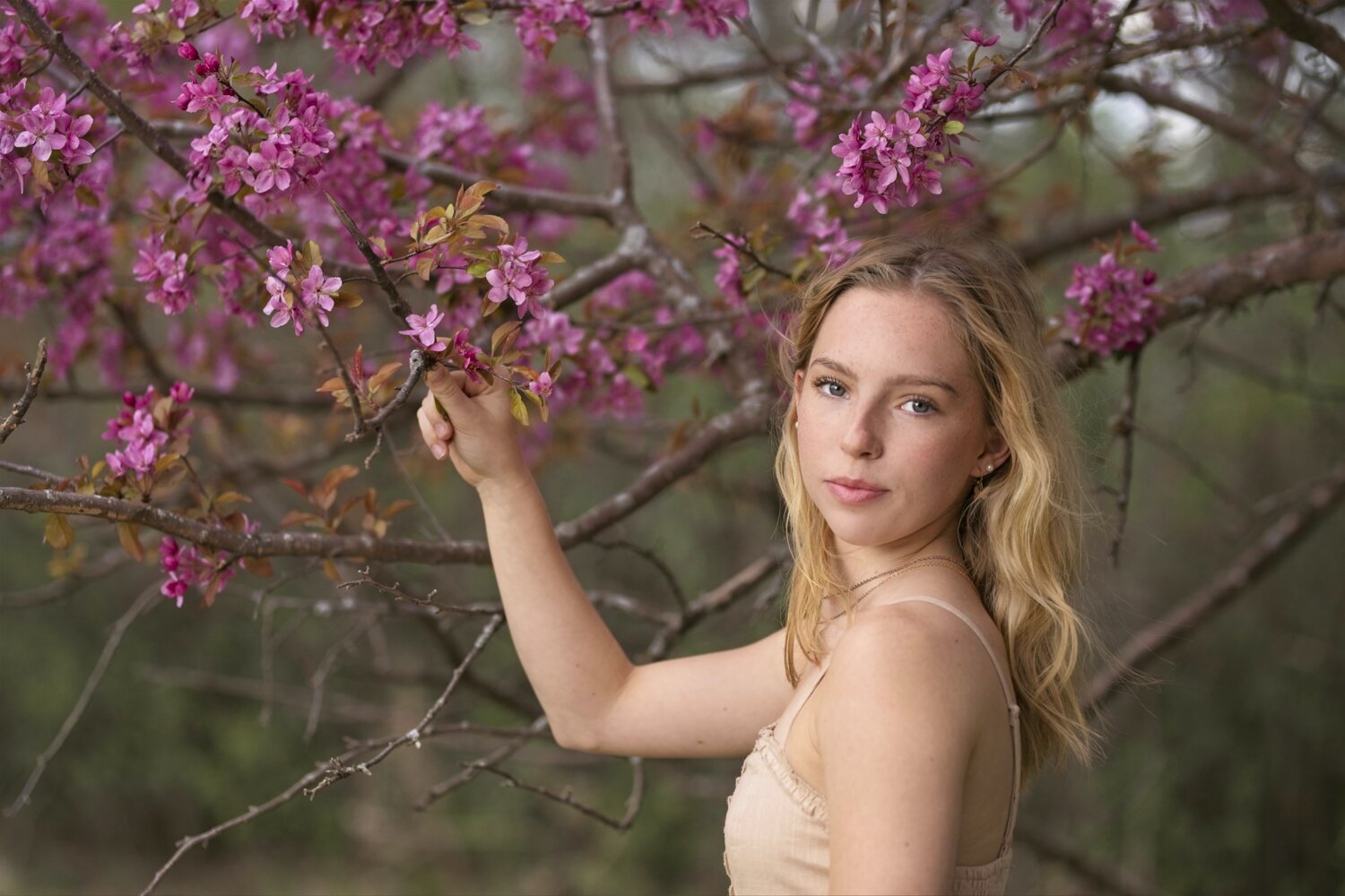
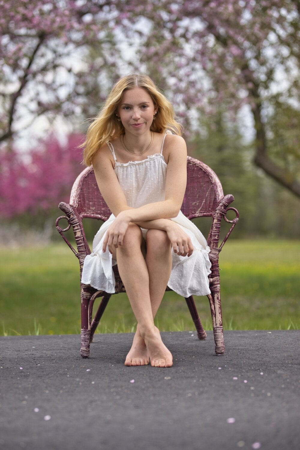
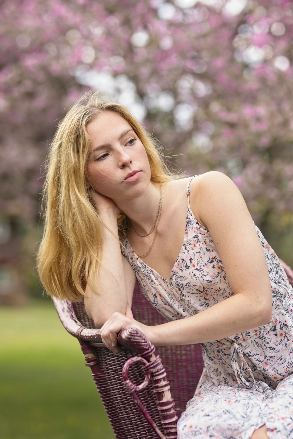
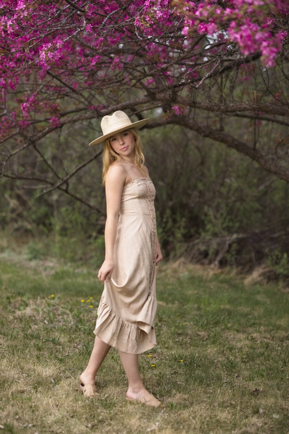
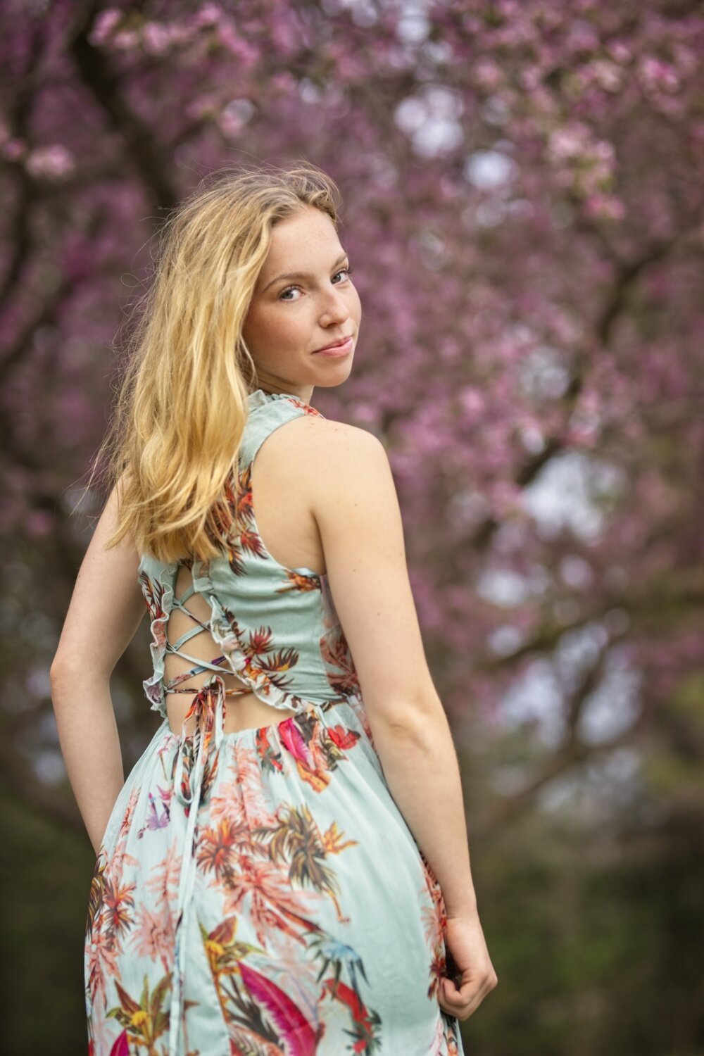
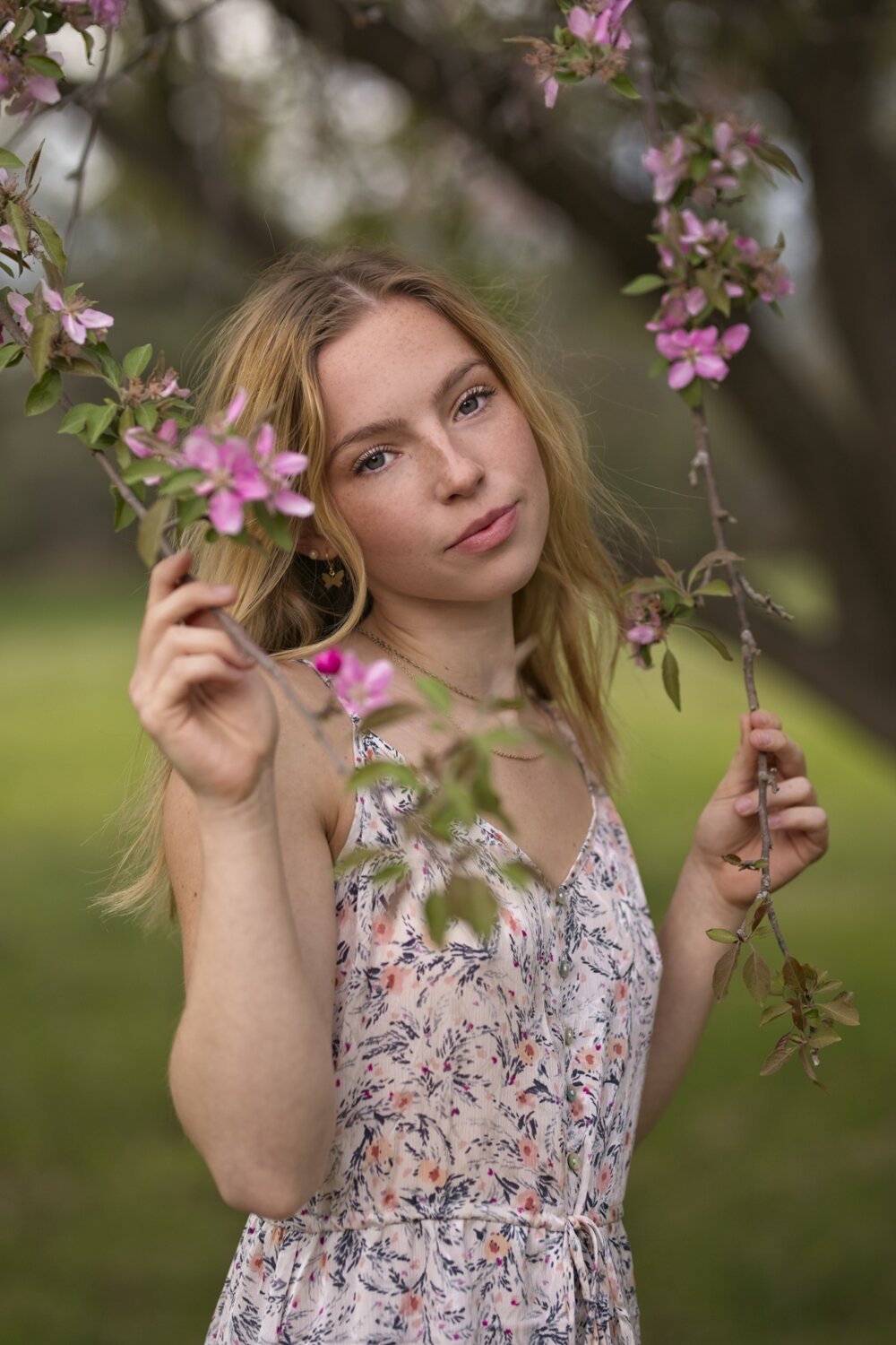
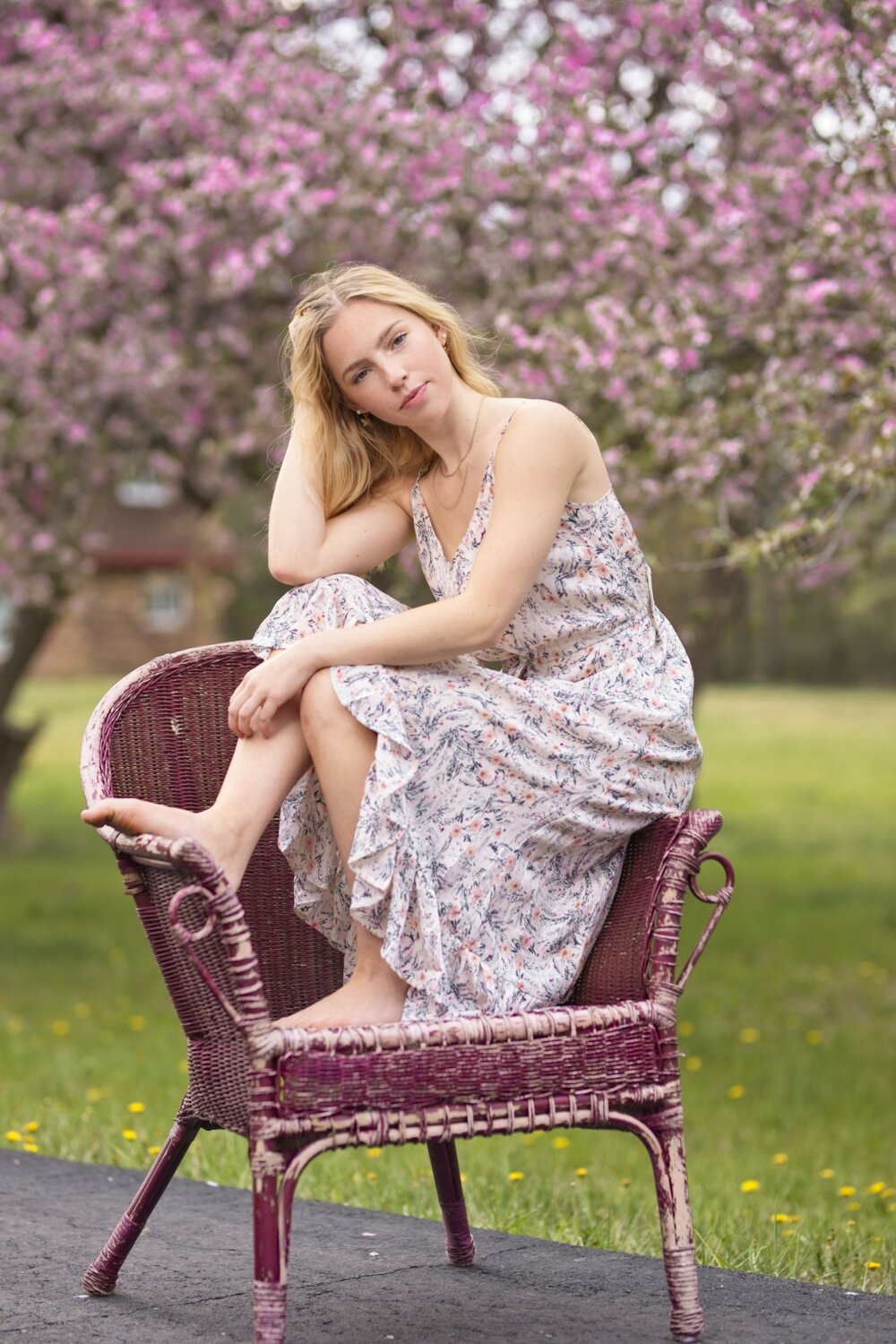
When I saw these beautiful crab apple trees blossoming, I knew I had to do a session with them! I asked the beautiful Rachel if she would let me photograph her for some marketing images and she gladly agreed. To me, the trees were vibrant, but feminine. They evoked a romantic spring vibe. I knew that the styling would have to match. Having her pose in a pair of jeans and a T-Shirt would never produce the same effect as finding soft and flowing dresses.
We are at the advantage of having Blush an amazing boutique located here. Penny is always more than willing to help me carry out my visions. We wandered through her store and we pulled the dresses you see in the images. I was careful to pick colors that would compliment the vibrant pink. What would those colors be? Understanding color theory, and using a handy app I have, I knew what to avoid, or what would work. This was a good starting point.
Color theory is HUGE in understanding why some images just jive more than others. In understanding what colors work, the whole image become cohesive and more pleasing to the eye.


